An Introduction
Since Census Reporter’s launch in 2014, one of our most requested features has been the option to see historic census data. Journalists of all backgrounds have asked for a simplified way to get the long-term values they need from Census Reporter, whether it’s through our data section or directly from individual profile pages.
Over the past few months I’ve been working to make that a reality. With invaluable feedback from many of you, I’ve made significant progress in bringing historical data to our community. In the same way that CR made working with census data easier than ever, I’ve strived to make using historic data easier than ever.
This post reviews my efforts, documenting the insights of months of iteration and review. Some of it highlights the pros and cons of specific data visualization methods, like bar charts, line graphs and scatter plots. Other paragraphs address the broad challenges of historical census data, including how to design for comparative significance at different population levels, or different summary level groups. Attached throughout are designs testing these questions and showcasing my thinking.
The hope is that I’ve presented a well-reasoned array of solutions for this challenge. Please leave your comments here, or use the feedback tab found on the Census Reporter site so we can continue building the best tool possible.
Cheers!
The Research
“I might visit historic data four or five times a year, and no matter how long I’ve worked with Census data I always feel somehow that I’m starting over.”
From the start, I knew incorporating historic data meant providing new answers to new questions.
The reasons for visiting Census Reporter varied widely. Some users saw Census Reporter as a launching point, researching specific table numbers in a category or scrolling through a profile page for highlights before going to another tool. Some were heavy-data users, downloading large files to analyze and build their own visualizations. Others were perhaps completely new to census data, trying to learn top level things about a new location.
Even for the same person, this changed depending on the story and assignment. The uses all had equal value, which meant CR had to do a lot of things well.
How to show significance when things change
“It depends is probably not what you want to hear, but that’s what it amounts to.”
Right from the start one of the biggest challenges was showing significant change over time.
As anyone who’s worked with census tracts or block groups will know, at a certain size the margin of error for a statistic can exceed the estimated value of that statistic entirely. This means that any changes within these areas could be random, and potentially insignificant.
While this may be somewhat rare, a much more common problem is determining when change mattered. Was there a cutoff number or percentage to say “this is interesting, look here”? Maybe an index, or a value to say “this place changed x more than these places and therefore is more interesting.” There’s a danger in overstating the importance of a shift, however.
As I thought more and more about a mathematical indicator, I became concerned about the significance at scale. In some instances, like with census tracts and block groups, the change might be smaller than the margin of error. This means that if a group of 1,000 people changed by 300 people, but the margin of error is 500 people, it could’ve increased 30 percent or decreased 20 percent. That doesn’t inspire confidence. Especially not when you’re comparing a 3% change in a place with a large, relatively-fixed population to a 3% change in a small, rapidly changing population.
Rates significantly help control for those variations, and make numbers far more comparable. Still, this line of thinking was important in designing appropriate solutions.
The visualizations throughout are not necessarily based on actual Census data. However, during the course of research, sample data extracts were tested to get a sense of how designs would play out with real data.
Comparing change at scale
One of my earliest visualization ideas was to use line charts, sort of as a one-treatment approach for both linear values like age and categorical groups like race and ethnicity.

But I pretty quickly ran into hurdles.
Likely the most noticeable, especially with population by age range, is how flat the lines were. Even if there was significant change happening, it was hard to show because of the axis. Accounting for multiple categories in a chart made it hard to compare each category. I found, too, it would be even more challenging to compare it from place to place.
Also, if there were many lines, like there would be in race and there would be in place comparisons, would the lines accurately reflect change? If, for example, I compared a large city with its contained census tracts on an indicator like number of households, the city would stretch the visualization with a high number, skewing the change of the tracts.
I kept running into this problem in different ways. Let’s say there are only three categories in a group of eight that sit above 10%. The remaining five are around 2%, 1% and even 0%. By using lines on a 100% scale, CR can show the difference in values for the categories over time, but what that wouldn’t reflect is the proportional changes of lower numbers.

As I began comparing not just tens, but thousands of places, I saw there were too many holes in this one-treatment approach.
Grouping places by geography or size
“For one story, we looked at 18 towns along this one NJ highway to see how the towns changed over time.”
As it was before historic data, deciding whether to provide context with places similar in geography or in population was a challenge. In a previous post, we argued that a city like Chicago might have more in common with a New York, Los Angeles or Indianapolis than with a neighboring town or tract. Places with lower populations, our feedback suggested, were more likely to share characteristics with their neighbors.
Much of the thinking here hasn’t changed, with perhaps the only caveat that most of the people I spoke with were more interested in nearby places when using historical data.
Showing change of a whole or change of an item
Frankly, this is an area I’d love more feedback in. I’ve spent a lot of time iterating on this concept, which you’ll see below. Essentially, the question is “are users more interested in how one specific category in a table changed, or the holistic change of every category?” Put another way, are users after the part or the whole?
It might not mean much to know the percentage of white individuals has decreased by three percent in area. In my view, it lacks context to the broader shift over time. But I saw value in providing the change of every group as a whole. Seeing how the whole of the race and ethnicity category has shifted shows an ethical representation of the whole, which is more complete.
The Solutions
Bar Graphs
Bar graphs, immediately recognizable, were one of my first solutions.
Bars do a lot well. They’re generally attractive, easily show differences when side by side, and apply to a host of values (percents, totals and averages). Plus, they’re already part of Census Reporter’s profile pages, meaning an almost non-existent learning curve.
Great! But unfortunately, showing nine bars in a section is different than showing nine bars for every available year.
This was one of the first and most significant issues I had to reconcile for the project.


I tried a few different things here. Creating a bar for each year per category was appealing, but quickly seemed less so when the page became cluttered. Limiting to only certain years, like 2009, ’12, ’14 and ’15 helped, but couldn’t save things when we expanded it to datasets with more than a few categories.
In the interest of presenting the whole rather than the part, I tried equally-sized bar graphs for the set of categories, lining them next to each other. Unfortunately, this approach was ink-heavy and didn’t neatly show difference in the way we hoped.
Also, if we grouped bars for each year within a category, it did this:
Gross. And that’s not even half the available data.
Sparklines
In a move away from bulkiness, I went agile. Sparklines, those little things in Excel that show trends, could be placed on every data point and, with the combination of a clickable line chart, show all of the historical data.

I liked this solution for a long time, playing it out in a host of different design variations. Like this one:

The more I went through it though, the clearer the cons became.
Pros: it does what I want it to. With some interaction effects, CR could create a reliable way to see every single data set, its trend, and specific values for a period. This is great! Not to mention the lines were compact, and could fit anywhere.
Cons: It didn’t place the data in a context. You more or less were asked to either amalgamate the lines in your mind, or be content with having the values sans other info. That was an important enough con to me that sparklines didn’t entirely get there, so I kept going.
Line Charts


Line charts! Yes, these are also lines. But instead of being one line showing a trend, they were charts. As I alluded to in the research, using lines to show change over time was simple and comfortable. It’s a common pattern users are familiar with, and one capable of showing basically any value.
I first tried linear values, like median age, and groups, like population by age category.


Some initial pros and cons:
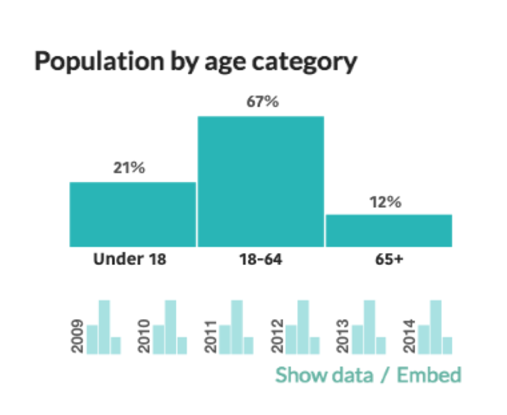
Pros: Comfortable, logical and familiar. We’re used to seeing lines represent a value and move over time, so even when faced with multiple lines and colors, our eyes can get there. Specifically regarding the median age category, the context sentences are still there too. With some form of interaction, CR could keep the structure and added information the sentences provide.
Cons: As you’ll notice, many of the lines are pretty flat. This reflects an axis issue. If I gave the y axis a lower limit of 60% and an upper limit of 70%, and the number is, say, 64% +- a few percent each year, then that line will bounce around. The same problem exists with how we set limits for male and female. If the axis is 0% to 100%, the lines will be flat. If it’s 45% to 55%, it’ll move. When using line charts, this problem applies to roughly all of the values.
There are certainly arguments for truncating the y-axis - this article does a helpful job explaining why and how Quartz does it. But there are still ethical concerns about if a truncated axis reflects data’s real change. Plus, the value we might gain truncating could be diminished by constantly moving y-axes, likely to disorient and tire users.
I found enough pros with lines, however that it was worth further exploration. In the images below, I replaced the text with grey contextual lines and fixed the axis between 0% and 100% when appropriate.

In these charts the green lines represent the specific value, while the grey lines represent values of similar places. These lines are value approximations, but represent the idea of putting a city, like Chicago, alongside other cities in its county, or along census tracts inside it. There are two immediate advantages to this.
The first, that a nearby geographical context is provided. This would be explorable with a mouseover event, revealing the names and potentially the values of the other locations. The spatial placement and density mean the eye immediately knows where your current location falls within a set.
The second advantage is because there are comparative lines, even if most of the lines are flat, you can see if your line is more or less flat than other lines. The goal of this would be to communicate, even if little has changed, how little has changed and what that means in a set.
This addressed a lot of issues for me, especially when graphing single values. But it didn’t fix the category visualizations.
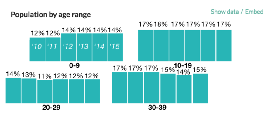
Small Multiples

Popularized by Edward Tufte and a frequent tool in data vis, I felt small multiples could bring something to our page. The idea was that by presenting a visualization, like population by age range, once, it could be broken down into smaller versions of itself that communicate change through shape and less ink.


The multiples above retain their shape, doing so at a reduced scale. They present the whole many times over and allow you to see for instance, that while the 10-19 group’s percent fell from 2012 to 2013, the 0-9 group went up, potentially an indication of a high birth year. I tried this approach for pie charts as well…

…but felt they struggled to show change from chart to chart. Perhaps the best thing about the bar chart small multiples was how effectively they handled any of the present bars. Even in situations with large gaps, simply putting the years in between each multiple kept the order in place.

Because of these reasons, this is a visualization I strongly feel accomplishes a goal with few drawbacks. It’s fair to note that due to a small amount of change for many larger places, there may be issues detecting shifts in the graphics. If that’s the case, this doesn’t really work.
As goes for everything posted, your feedback is not just appreciated but needed to make the best Census Reporter possible.
‘Nothing to see here’s and Scatterplots
Relatively confident in the contextual lines and small multiples, most of the sections had treatments designed for them. However, I was still left with the pie charts.
CR’s pie charts feature roughly two to five categories, dividing along that upper limit with grouped bars. Many of them feature only two or three stable categories, like sex, age category and marital status. Given the category number and relative stability, there are a few options.

I could represent them much like the other small multiples. Because some of them have as many as four or five categories, by their nature the challenge is similar. However, introducing small multiples here sort of overwhelmed the page, ensuring nothing stuck out. Also, because of the larger bucketing, many of these groups were less likely to change, making small multiples less valuable.
If the eye can’t see a change when it’s there, they’re not working.
Featured here, I tried a line chart for the sex category. This was okay, but as more than three colors were introduced, it became hard to process. Also like above, these lines were generally flat and because of the categories would be harder to give contextual grey lines.
This was a struggle. The number one goal with the profile pages is to show quick, accessible data. This data as it was, I wasn’t sure if we could do that.

For now, the treatment was an indicator, stating "the data shows minimal to no change over time."

With specified treatments for all of our profile page data, I had time to explore some other solutions for Census Reporter.
We’ve talked about a compare page before, even designing one here. We liked the idea, but due to some user-confusion in testing and its overall complexity, never made it a reality. We’ve wanted this for a while, but it felt even more pressing as I considered the possibilities of comparing and ranking historic data. Many of these kinks still need to be uncovered and designed, but trying to map thousands of points (census tracts, places, etc) led us to scatterplots.

This design does fail to provide context, but is a general outline of what a section like this could do. Being able to compare places, and eventually rank them by how they fall in a category or section (biggest increase, decrease, change, etc) will provide value to those who say, want to know which county is the youngest or oldest in Illinois.
The Next Steps

Putting together the line graphs, small multiples, and pie chart treatments above, this is the outcome I envisioned. Placed in the context of the Chicago profile page, this image includes only the demographics section but with simple adjustments could apply throughout.
Special concerns were taken to maintain the white space and accessibility of the page. My hope is these designs do that while providing the additional information and context we intended.
Getting historical data on the profile pages up and running is our primary step forward. This means development, data engineering, and testing. But as this process wore on I found additional value in a third page.
In the vein of the compare page above, I’ve started iterating on a ranked page. This would allow the user to rank significant amounts of data, like the change in all of the census tracts in a county for under-18 year olds, and then download it.
The first iteration shows the census tracts within Chicago, ranked by the percentage of biggest increase (estimations). These values are part of self-containing categories, which would be scrollable to reveal all of the data.

Immediately I like that the question of, “which places in this set increased the most per category?” is answered. That sort of information can be the catalyst for a story, providing a context to report around. I also like the option to download individual sets of data. I tried to use ink efficiently, but if there’s value we would absolutely include a “download all ranked data” button.
I didn’t love that it wasn’t obvious where the increases fell in the set. Unless you interacted with the category, there was no way to know what a standard increase was. That’s why I tried histograms, speculating again on Census tracts within Chicago.

You can instantly see what the distribution looks like and, by scrolling over a tract, can see it highlighted for each category.

Being able to see the tracts placed in all four of the categories tells you that the biggest increases were in the under 18 and 18-40 categories. This specific tract then, could be reported, has gotten younger over the past five years.
Conclusion
These are just some of the implementations we’re considering here at Census Reporter. With your feedback and a little work, we hope to get this tool where we want it, improving your data reporting experience.
This work was done as an independent study in Summer, 2017, but it would not have been possible without significant contributions and foundational work done by my Spring quarter teammates: Yingcong Fu, Jamal Julien and Bryan Li.